Dental clinic website
Sereno Dental
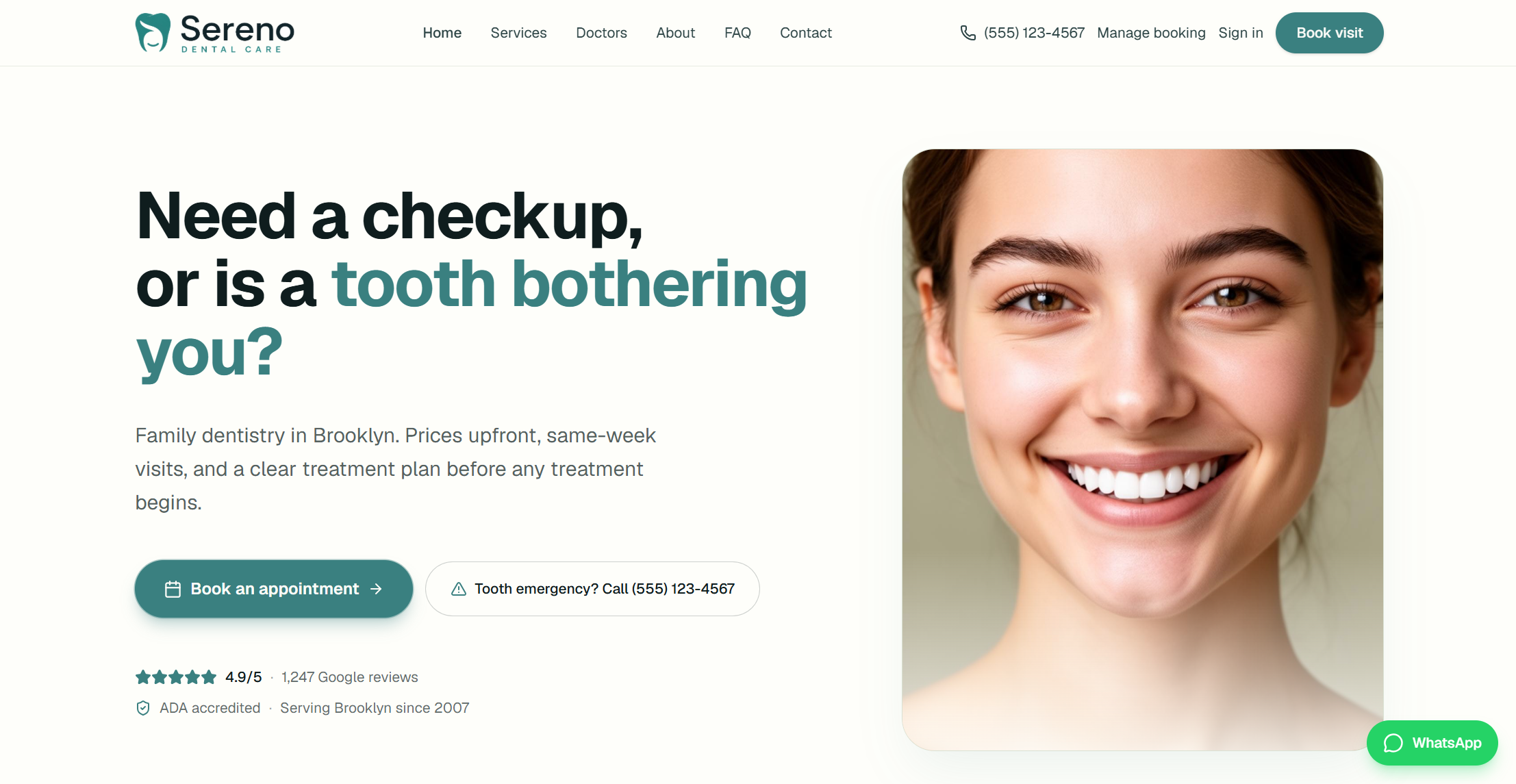
Dental clinic website designed and built around the questions patients have before booking, from treatment options and pricing to finding a dentist and making an appointment.
Business context and objectives
Who it's for
The website is for people looking for a dental clinic and trying to figure out what they need before they book. They might be comparing treatments, checking prices, looking at the dentists, or trying to understand what a visit will be like.
What the website needed to do
The website needed to answer those questions before the patient had to call the clinic. That meant explaining treatments, showing pricing information, introducing the dentists, explaining what happens during a visit, and making booking easy to find.
Brand and visual direction
The visual direction came from wanting the clinic to feel professional without making it feel cold or overly medical. I used muted greens, warm neutrals, rounded elements, and generous spacing to give the site a softer feel.
I kept the same visual language across the pages so the treatments, doctors, booking flows, and other sections feel like parts of the same website rather than completely different screens.
- Typography
- I used straightforward type that stays easy to read across treatment details, headings, and longer sections.
- Colour
- Green carries the main actions and important interface elements, while darker text and warm neutrals keep the rest of the page grounded.
- Imagery
- Patient and dentist photography is used where it helps explain a service, show the clinic, or make the experience feel more familiar.
UX and patient experience
The main design problem was the path from concern to booking, so treatment pages, dentist profiles, and appointment actions stay connected instead of living as separate destinations.
Treatment discovery
Patients start from a concern, then see recommended care, what to expect, and pricing cues before they commit to a visit.
Finding a dentist
Doctor profiles make it easy to compare dentists, specialties, and experience so patients know who they may see.
Booking an appointment
Booking stays easy to find, and patients can look up an existing appointment without digging through the rest of the site.
Design and development
I designed the interface and built the responsive front end as one system: shared components for treatment cards, doctor profiles, CTAs, and forms, so pages stay consistent without being copied screen by screen.
Layouts adapt from desktop to mobile without dropping key booking actions, and the visual direction stays tied to the same colour, type, and spacing rules across the site.
Selected screens
A selection of screens that show the main parts of the website.
Cost calculator
A practical estimate tool helps patients plan around out-of-pocket cost before they book a consult.
About
The clinic’s story, approach, and space needed their own place on the site, so I kept this section focused on the people and the clinic rather than turning it into another service page.
Pricing
Pricing is shown alongside treatment information so patients can get an idea of the cost before deciding what they want to book.
Contact
Location, hours, insurance notes, and a message form sit together so getting in touch feels straightforward.
Outcome
Patients can explore treatments, compare options, understand pricing, find the right dentist, and book an appointment from the same website.
The website brings these steps together in one place, making it easier to move from finding information to choosing a treatment and booking a visit.