Modest fashion e-commerce
Noor
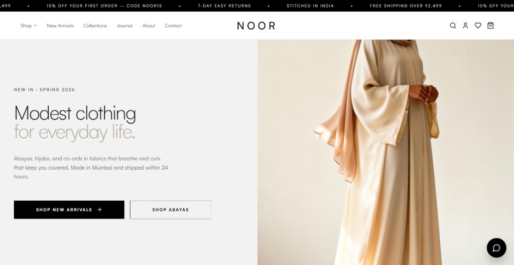
Modest fashion storefront designed and built around browsing collections, judging fabric and fit, and checking out through an India-ready payment flow.
Business context and objectives
Who it's for
Women shopping for everyday and occasion modestwear, including hijabs, abayas, co-ords, dresses, prayer wear, and accessories, with INR pricing and India-first shipping messaging, plus help content for international delivery.
What the website needed to do
Present the brand calmly, make categories easy to enter, help shoppers compare colour and fabric, and carry them through bag and checkout without visual noise. Journal, About, size guide, returns, and order tracking keep the store useful beyond the first product click.
Brand and visual direction
The storefront stays quiet so product photography can lead. Sharp corners, generous spacing, and a slim announcement bar create hierarchy while garments remain the main visual signal.
Neutral studio and lifestyle photography sit on white and warm bone grounds, so shop, product, and support pages feel like one brand rather than separate templates.
- Typography
- Satoshi handles display and body. Wide tracking on the NOOR wordmark and light display weights keep headlines editorial without competing with photography.
- Colour
- Black is the primary colour. Bone and taupe are secondary colours. White is the accent, while muted grey and border grey support the interface.
- Imagery
- Lifestyle and studio photography show fabric, drape, and coverage so shoppers can judge modestwear before they buy.
UX and shopping experience
The main design problem was the path from browse to bag, so collection grids, product detail, and quick comparison stay connected instead of feeling like separate tools.
Browsing the collection
Shop and collection views lead with photography, item counts, and filters so shoppers can scan fabric, colour, and silhouette before opening a product.
Choosing with confidence
Product pages bring imagery, INR pricing, colour and size selection, and add-to-bag together so coverage, fabric, and fit are clear before checkout.
Faster comparison
Quick view keeps colour, size, and add-to-cart in reach without leaving the grid, so comparing pieces feels light instead of starting over on every product.
Design and development
I designed the interface and built the responsive storefront as one system, with shared components for product cards, filters, CTAs, and forms, and Tailwind tokens keeping colour and type consistent across shop, product, and account views.
React and Vite keep iteration fast. Supabase holds catalogue, collections, journal content, and account sessions. Razorpay handles checkout for India. Layouts adapt from desktop grids to a compact mobile header without dropping search, wishlist, or cart.
Selected screens
A selection of screens that show the main parts of the storefront.
About
The brand story sits beside photography so shoppers understand why Noor exists without leaving the calm, editorial tone of the storefront.
Reviews
Verified buyer quotes sit near product context so social proof supports the next purchase decision instead of living on a separate page.
Search
Search opens as a focused overlay with popular queries, so finding hijabs, abayas, and co-ords stays quick from any page.
Contact
Self-service links, a clear message form, and WhatsApp sit together so sizing questions and order help feel straightforward.
Outcome
Shoppers can browse categories, compare fabric and colour, open product detail or quick view, and move into bag and Razorpay checkout from the same storefront.
Supporting pages for story, reviews, search, and contact keep the experience useful before and after the first product click, without breaking the calm visual system.